In this project I added a new feature to Apple Health, with thorought research to address user needs. I did heuristic analysis, background reseach and user interviews, which helped me to identify key issues. I prioritized essential solutions, and refined the feature through two rounds of user testing.
Goal was to create a feature that enhances usability, boosts user retention and engagement, and promotes lifestyle improvement by fostering motivation and better health habits.
Role
UX Researcher, UX Designer, Student at Parsons The New School
Timeline
Nov 2024 - Dec 2024 (6 Weeks)
Tools
Goal Statement
To create a feature that enhances usability, boosts user retention and engagement, and promotes lifestyle improvement by fostering motivation and better health habits.
CLICK HERE TO JUMP TO THE DESIGNS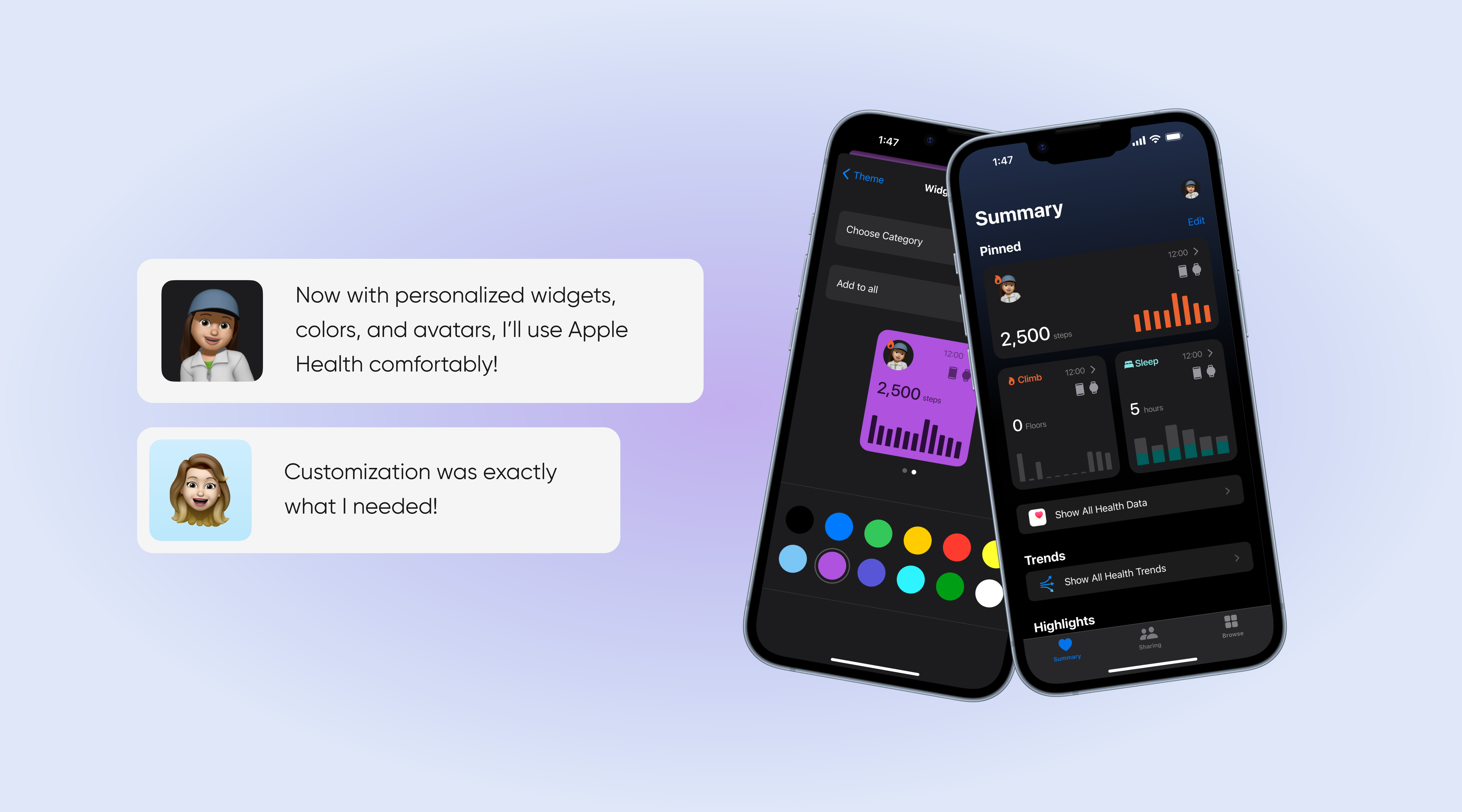
01. Discovery
Click for research conclusionsWho are the type of users?
I categorized Apple Watch & iPhone users in order to better understand which user types I will be addressing on this project. Since Apple Health is a very common and popular app the user base differs when it comes to their needs.
Hence:
Health/Lifestyle conscious people and data enthusiasts
People who simple like storing and tracking their progress. These individuals are more interested in less specific, official (doctor, medication -specific) health data such as Fitness, Sleeping & Mental health
People with chronic illnesses, in need of special medical attention
Individuals who use the app’s features, like heart rate monitoring and ECG capabilities, to help manage specific health issues.
The type of users I will focus on will be “Health/Lifestyle conscious people and data enthusiasts” because I am part of this crowd and getting user data from this user base is more accessible for me right now
Finding the Problem
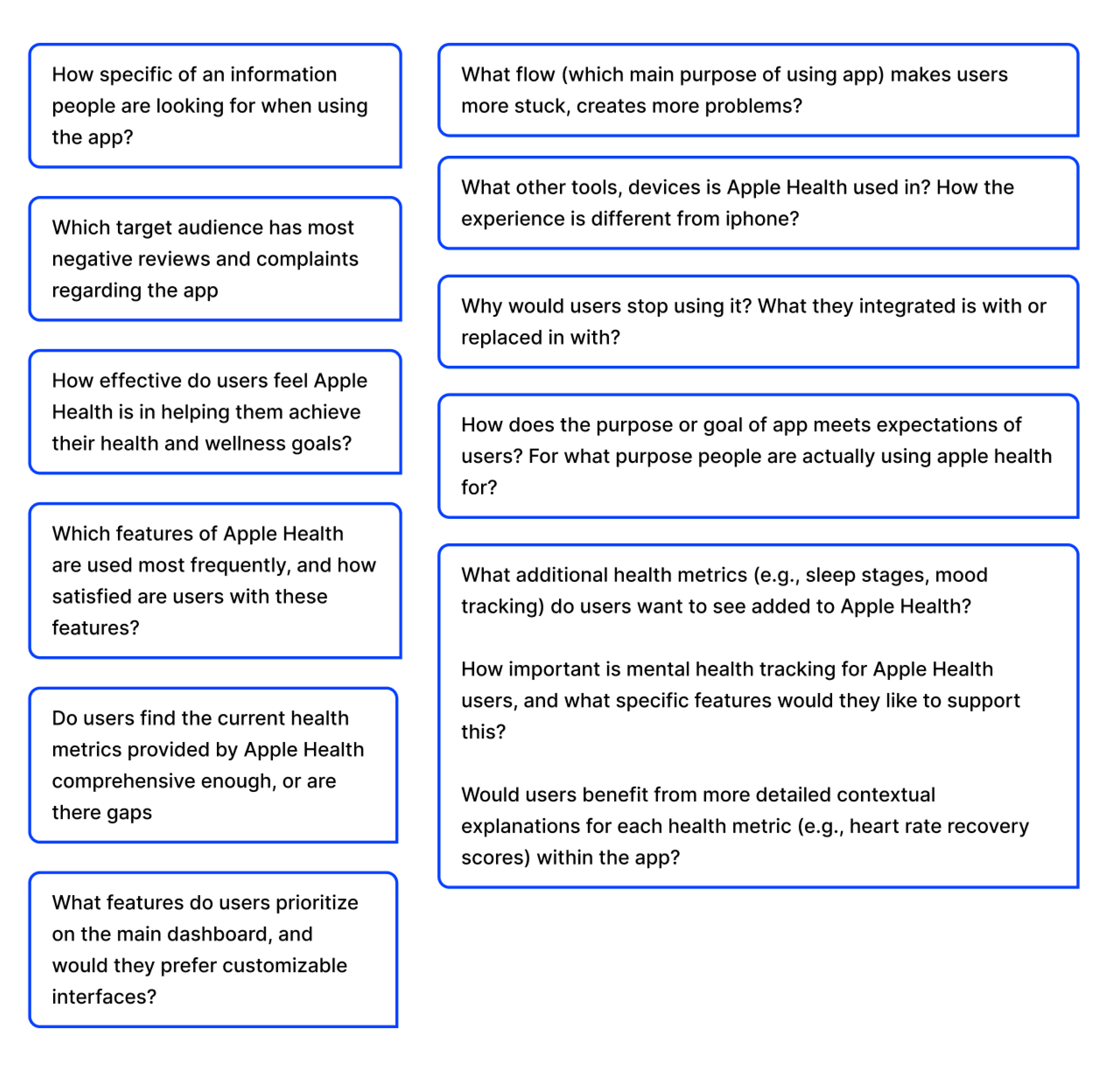
I conducted app audit, secondary and competitive research first. Then, I retrieved some research questions to discover during interviews and survey:
Primary Research
Survey was conducted before the interviews to understand the main pain points and identify major topics to discuss during the interview. The focused behavioral trait for interview participants was: Anyone who had experience with apple health.
Then, 4 interviews were conducted with the goals:
Usage Patterns & Motivations:
- Understand why people use the Apple Health app
- Document how they interact with it in their daily lives
- Identify what keeps them engaged or causes them to drop off
Feature Assessment:
- Evaluate which features (mindfulness, steps, menstrual tracking) provide most value
- Identify gaps and opportunities for improvement
- Understand user preferences and pain points
Participant Information:
- 4 Interviews
- Behavioral Trait: Using app for lifestyle improvement
- Age Range: 18-35
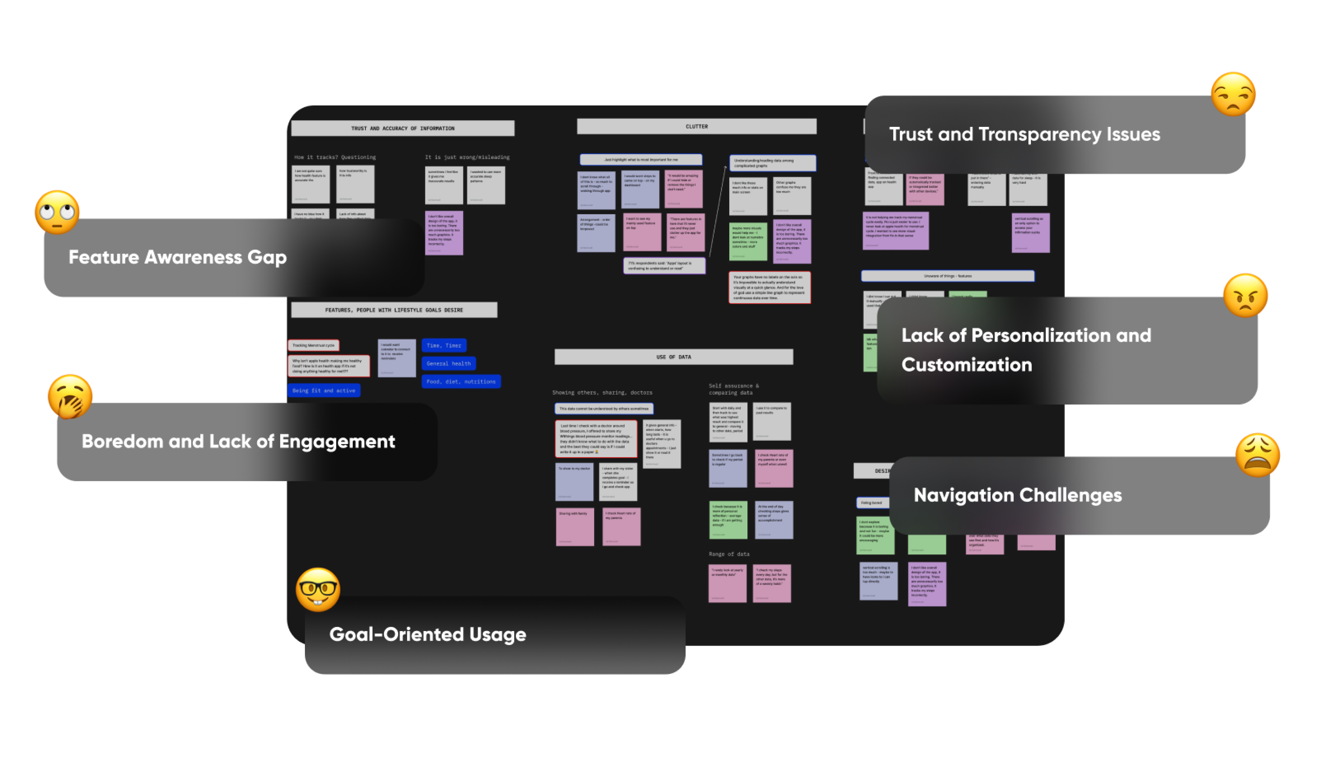
Interview, Survey, secondary research Synthesis and retrieved themes
I don’t like overall design of the app, it is too boring.
There are unnecessarily too many things to do
It tracks my steps incorrectly.
02. Iteration & Ideation
Click for SketchesBehavioral Insights
I summarized the research findings and revealed some directions that reflect the behaviour patterns.
Trust and Transparency Issues
Users struggle to trust the app's data due to a lack of transparency about how it’s sourced and tracked. This erodes confidence in the app and makes them second-guess its utility.
Prioritization and Customization
Users feel frustrated when frequently used features are buried or hard to find. This creates friction in their interactions with the app.
Navigation Challenges
Users find the app’s layout unintuitive, making it difficult to locate features, connected devices, or apps. This limits their ability to explore and fully use the app.
Feature Awareness Gap
Many users are unaware of existing features or don’t know how to enter or use data effectively, leading to underutilization of the app.
Boredom and Lack of Engagement
Users find the app unengaging and crave more dynamic or interactive experiences.
Goal-Oriented Usage
Users rely on the app for goal tracking (e.g., steps, heartbeat, menstrual cycle) and comparing progress over time. They also occasionally share data with friends and family.
How Might We?
The behavioral insights gave me further discussion points to identify the major questions to be solved. Which are:
- How might we improve the app’s usability and navigation to ensure users can quickly find and access their most-used features and connected devices?
- How might we build user trust by making data tracking and accuracy moretransparent and easy to understand?
- How might make the app more fun and engaging so users do not feel need for another app?
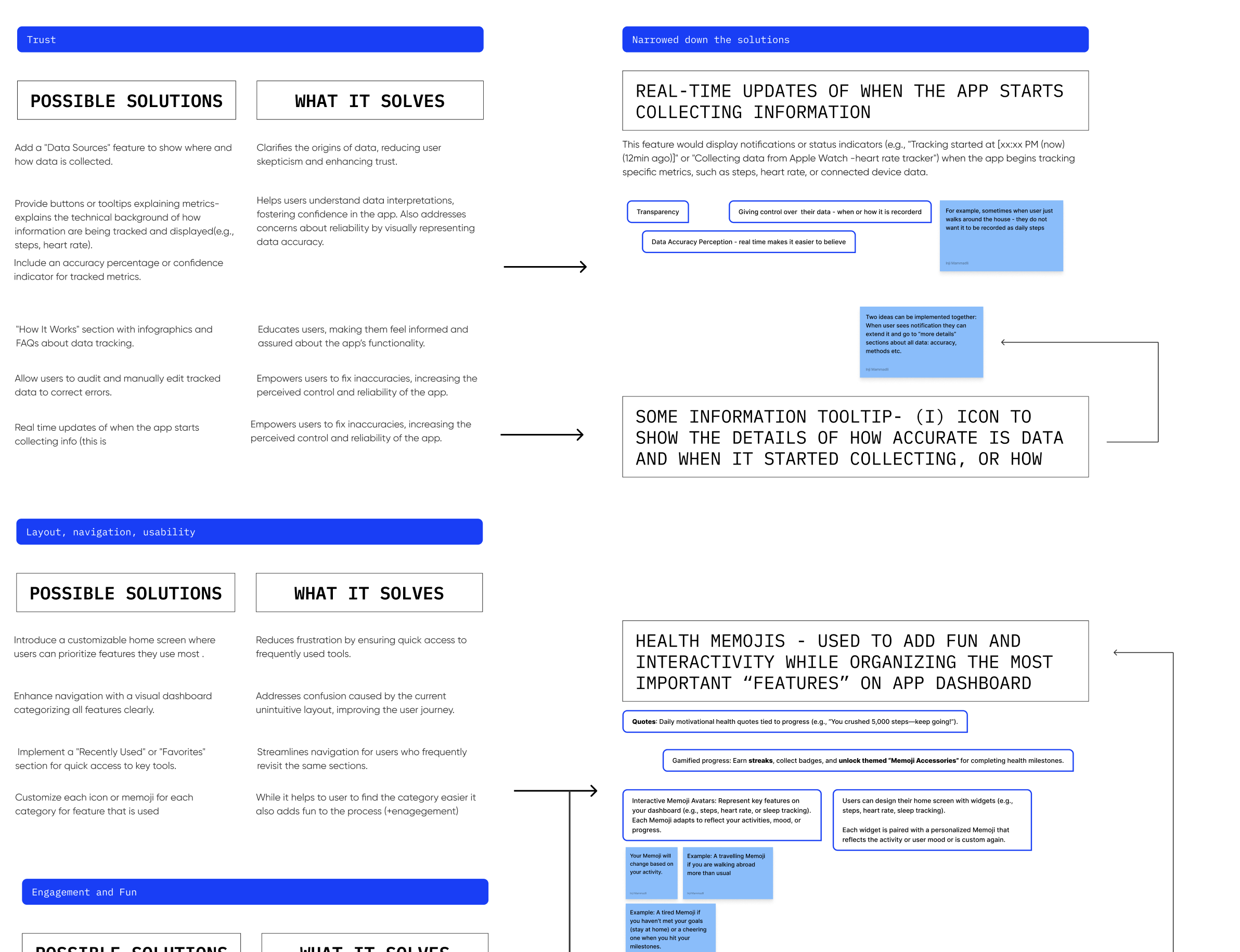
Mapping Ideas
WIP - Ideation
Summed up problems that users Face:
Trust
Layout, navigation, usability
Engagement and Fun
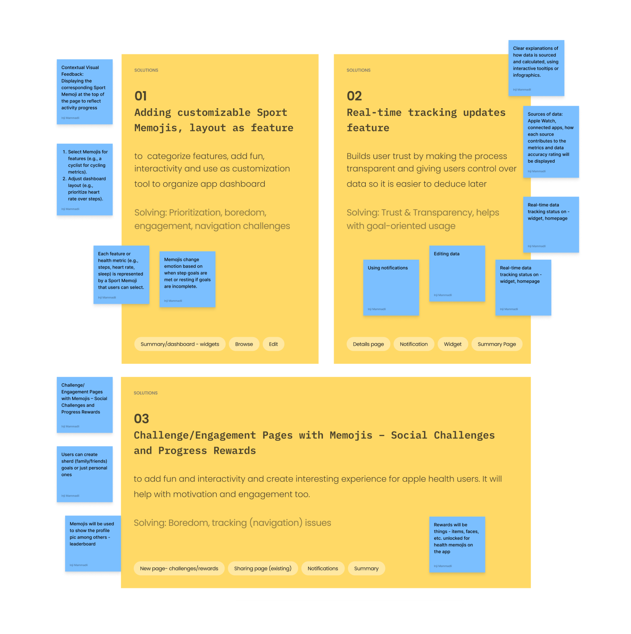
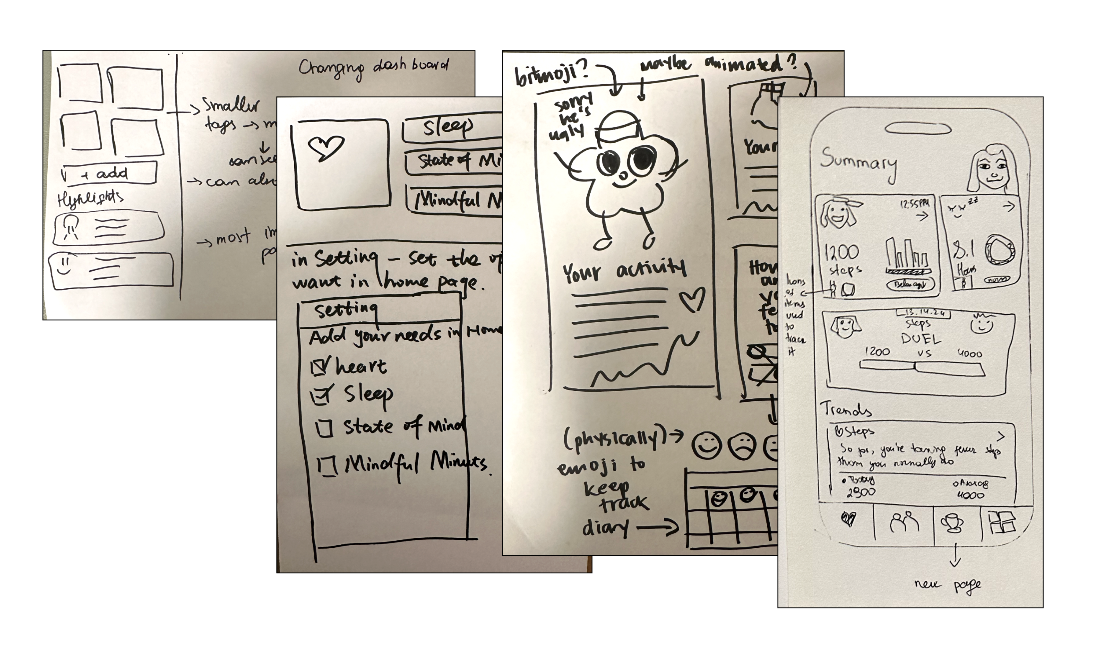
I came up with some solutions and decided to form my initial wireframes around these chosen features:
Solution
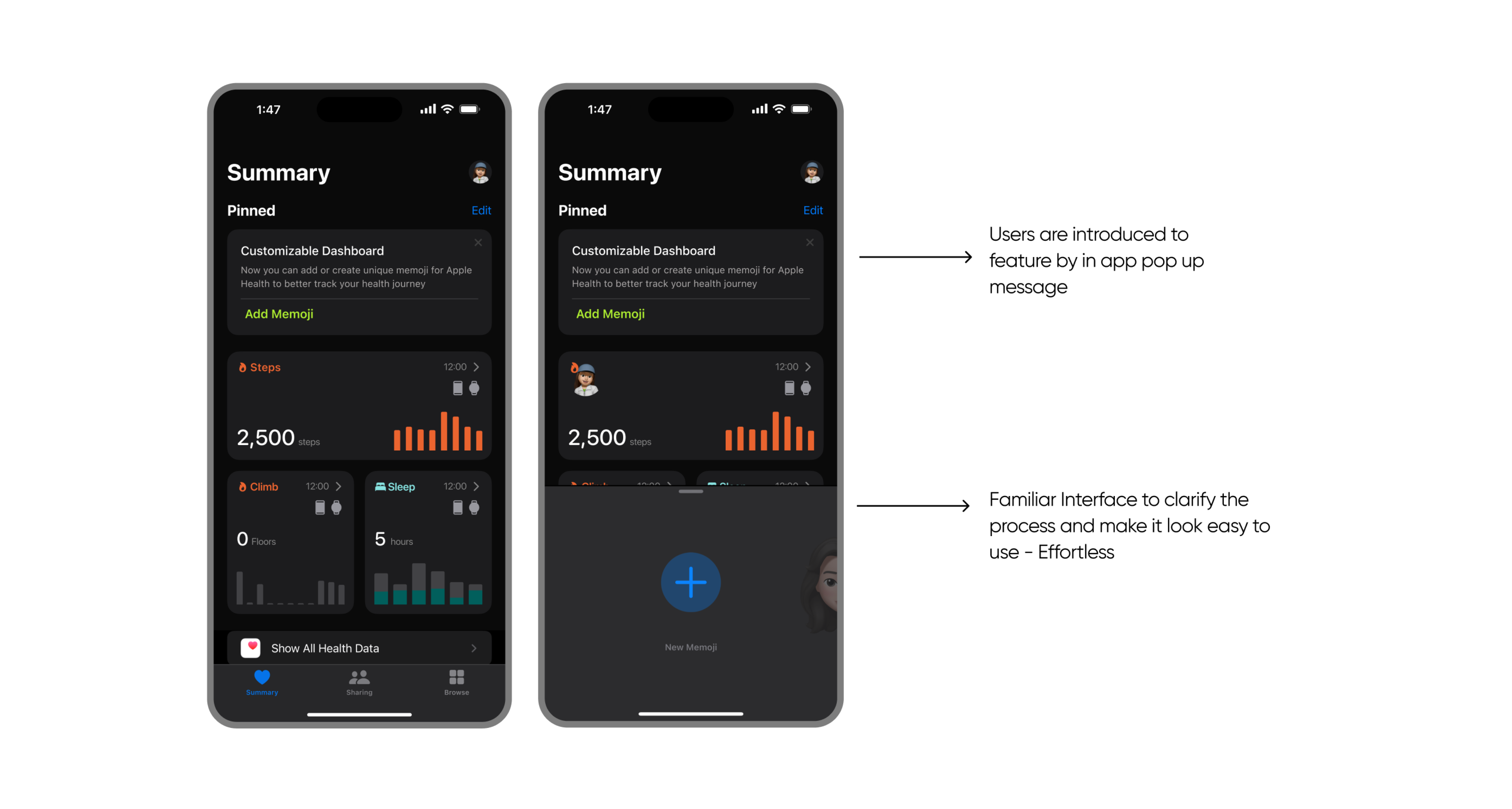
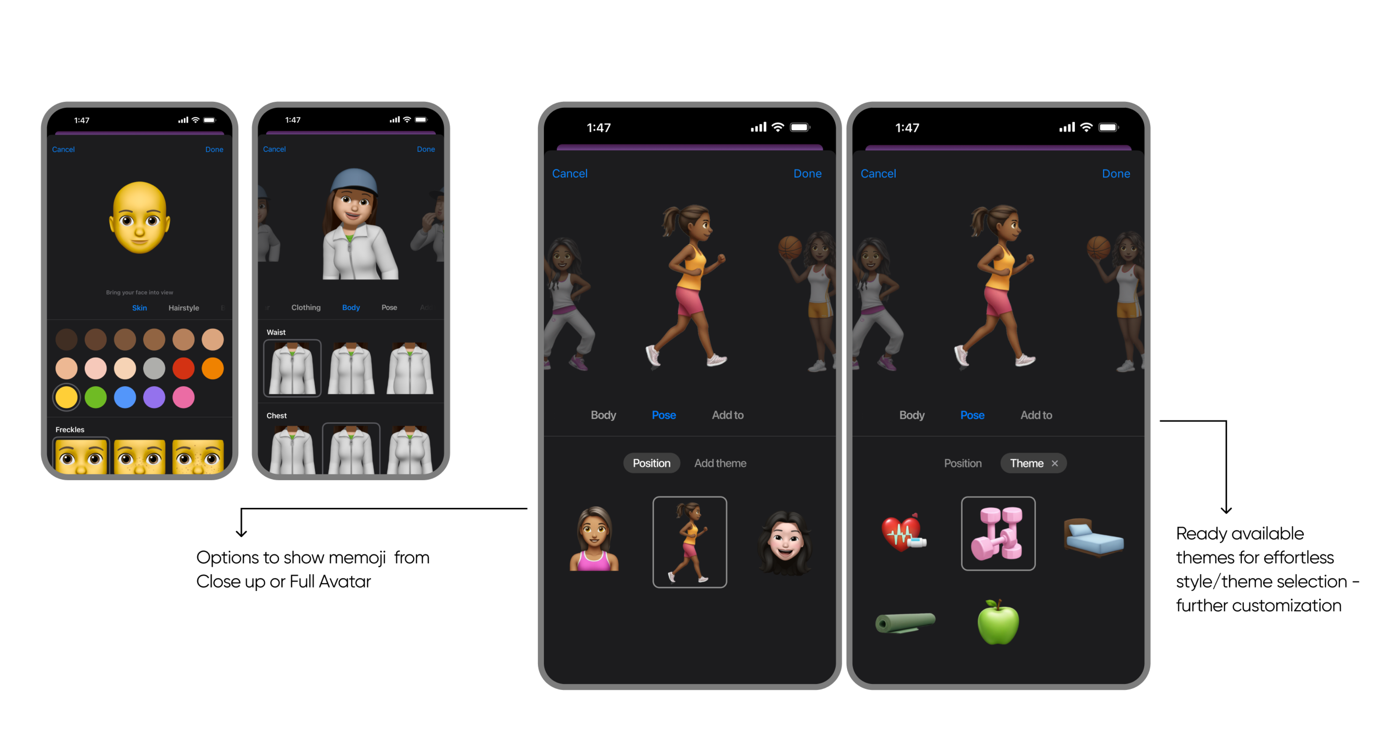
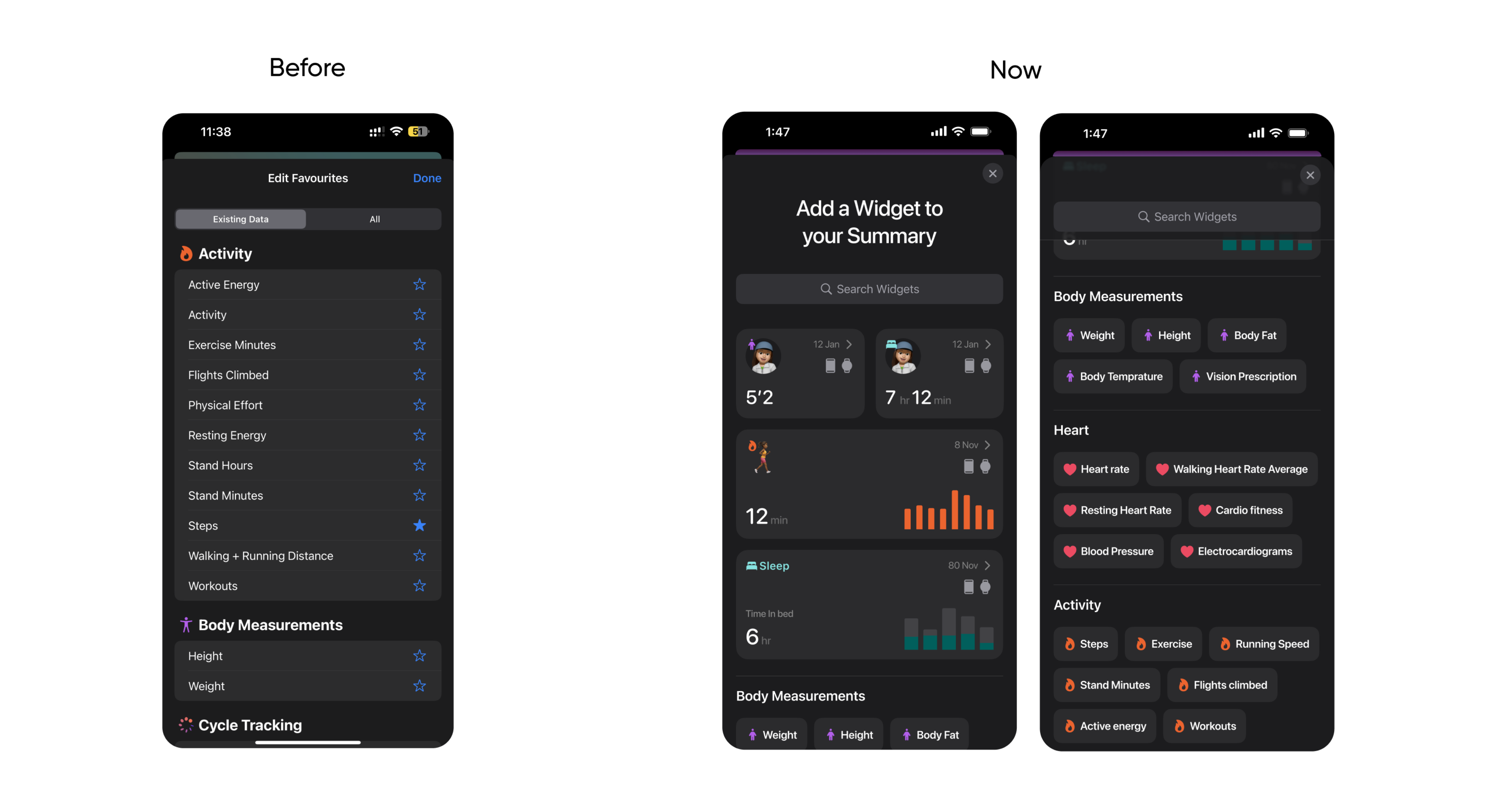
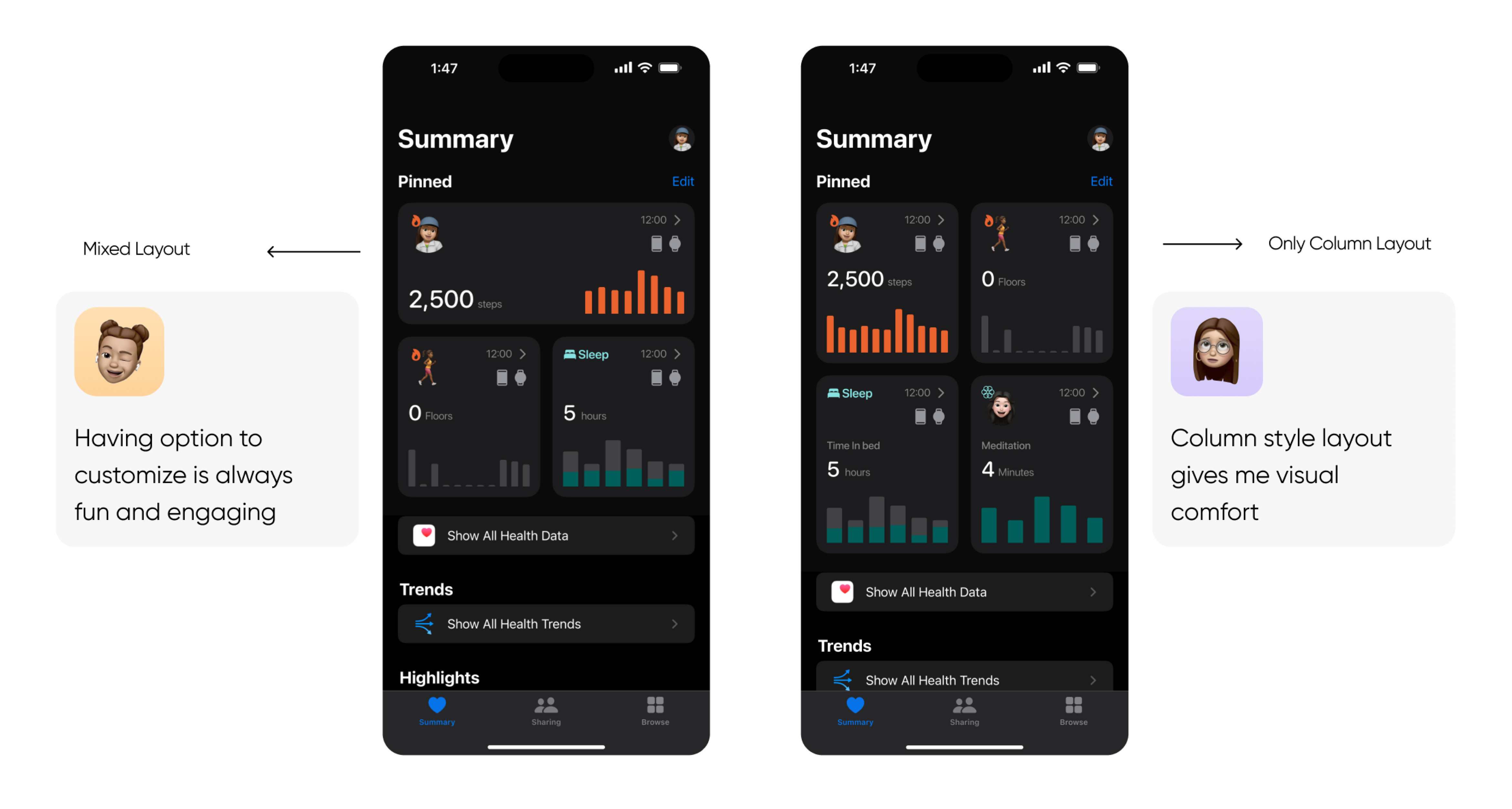
Adding customizable Sport Memojis, layout as feature
Solves
- Layout, navigation, usability issues
- Lack of Engagement and Fun
Solution
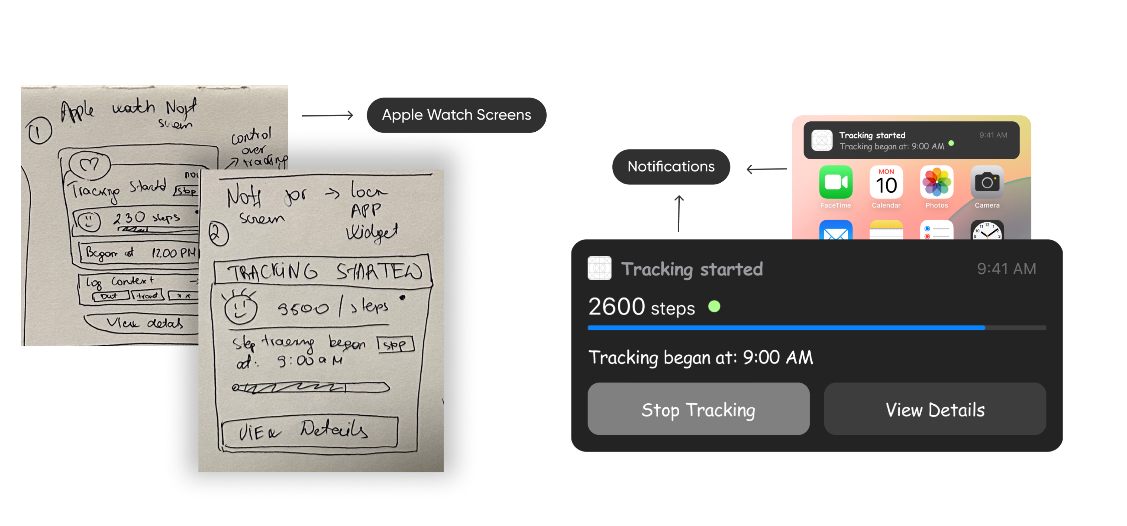
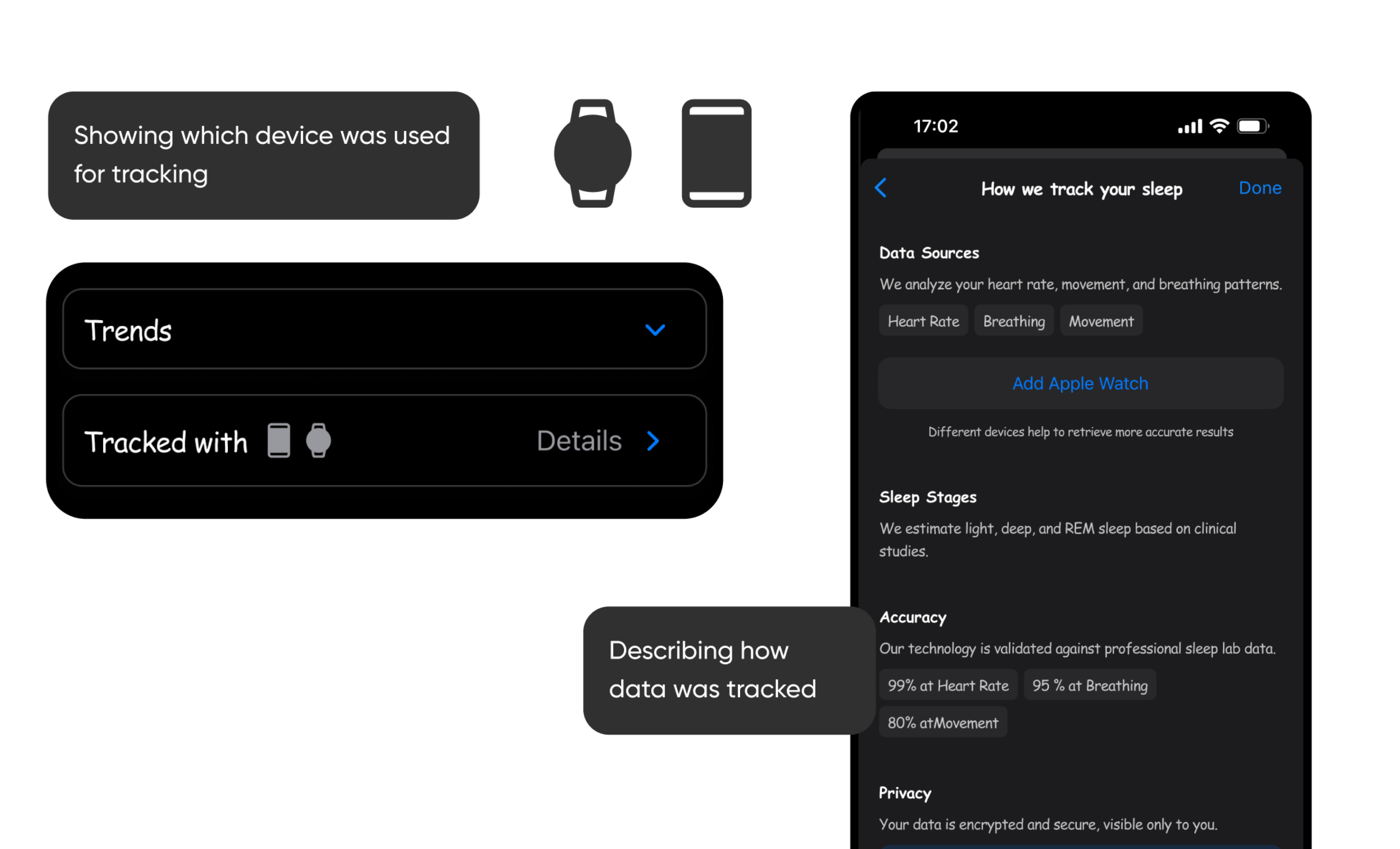
Real-time tracking updates feature which appears on different screens and includes detailed “tracked” data report
Solves
- Trust & Transparency
- Helps with goal-oriented usage
Solution
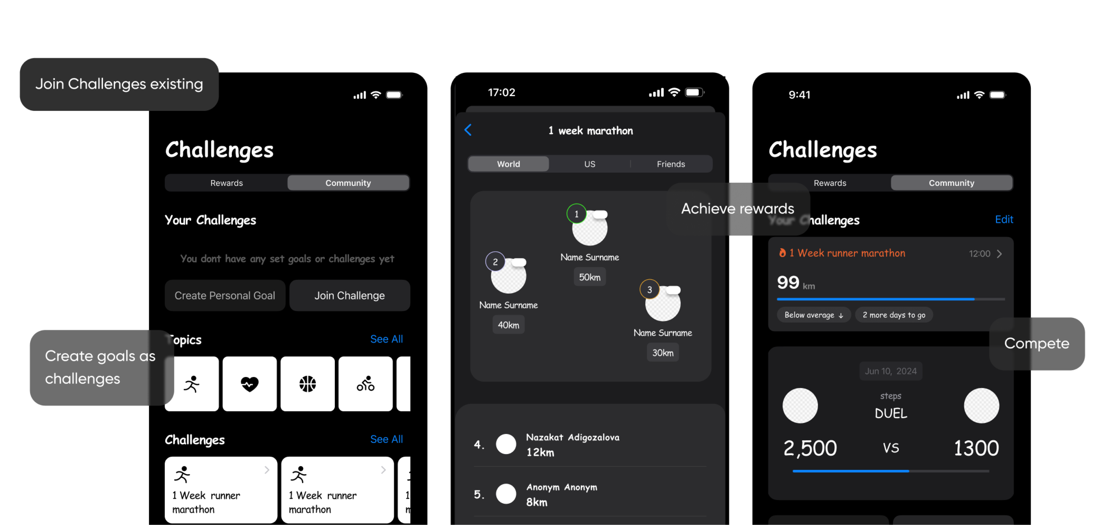
Challenge/Engagement Pages with Memojis – Social Challenges and Progress Rewards
Solves
- Boredom
- Lack of Engagement and Fun
03. Testing & Final Ideation
Click for Test ResultsI conducted usability text with 6 participants to test my “feature add on” ideas. I used wireframes and sketches to direct the interview and assigned 3 different topics with some scenarios for the test participants.
Interview/User Test Scenarios
01 Customizable layout and health memojis:
- Create or edit a Sport Memoji to match your preferences.
- Change the app’s theme color and card style.
- Reorganize the dashboard into a layout you find most useful.
02 Real-time tracking updates feature
- Check a notification about recent health data tracking.
- View the details page to see how data was collected and which device was used.
03 Challenges with rewards
- Review Challenges Community, set personal goal or join public challenge. How would you track your progress?
- Explore the leaderboard
- Unlock an accessory for your Sport Memoji as a reward for completing a challenge.
Interview Results
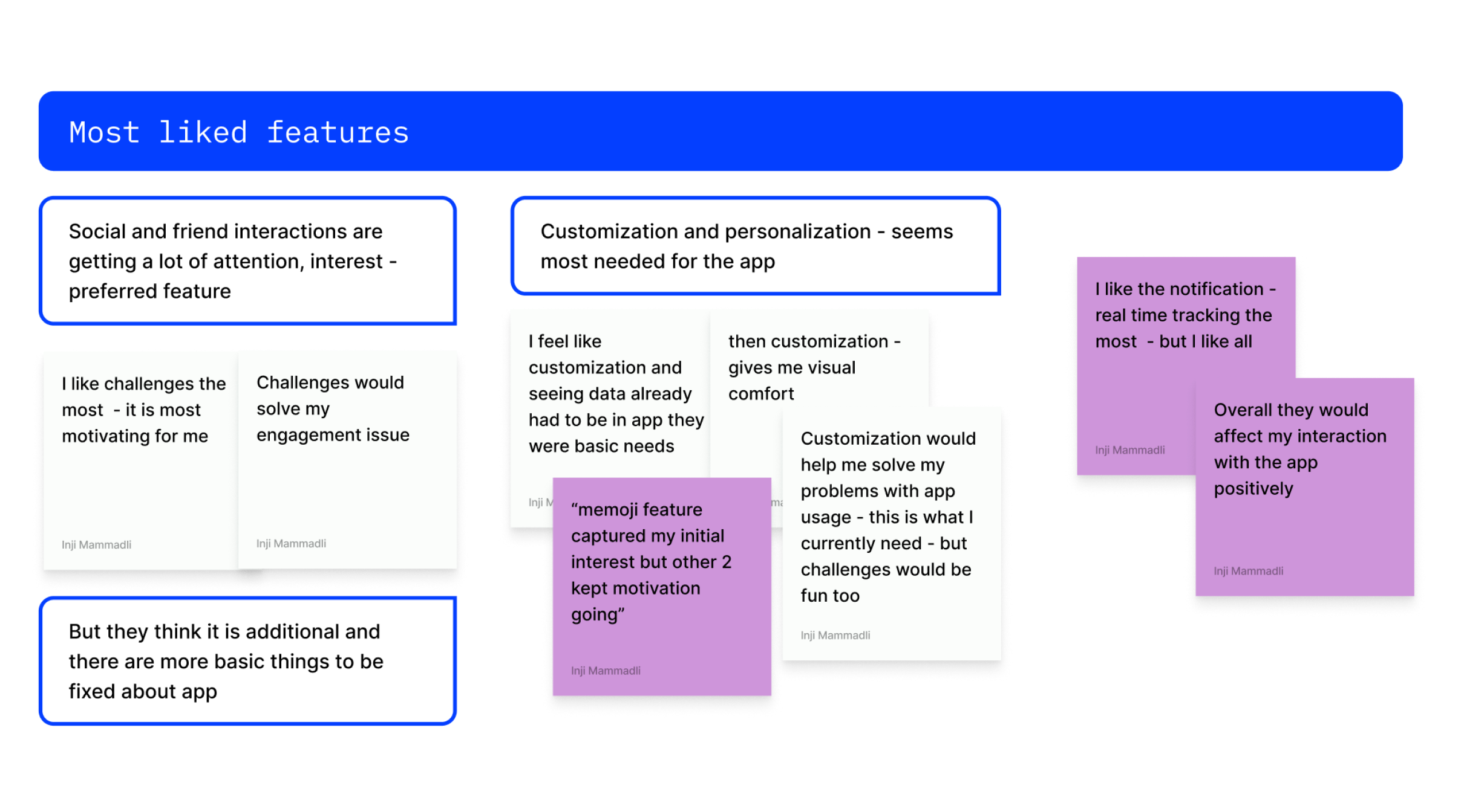
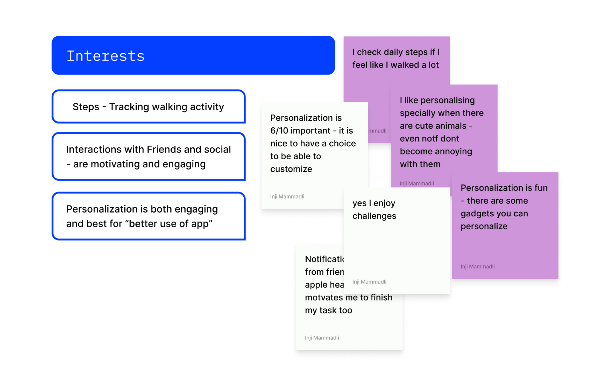
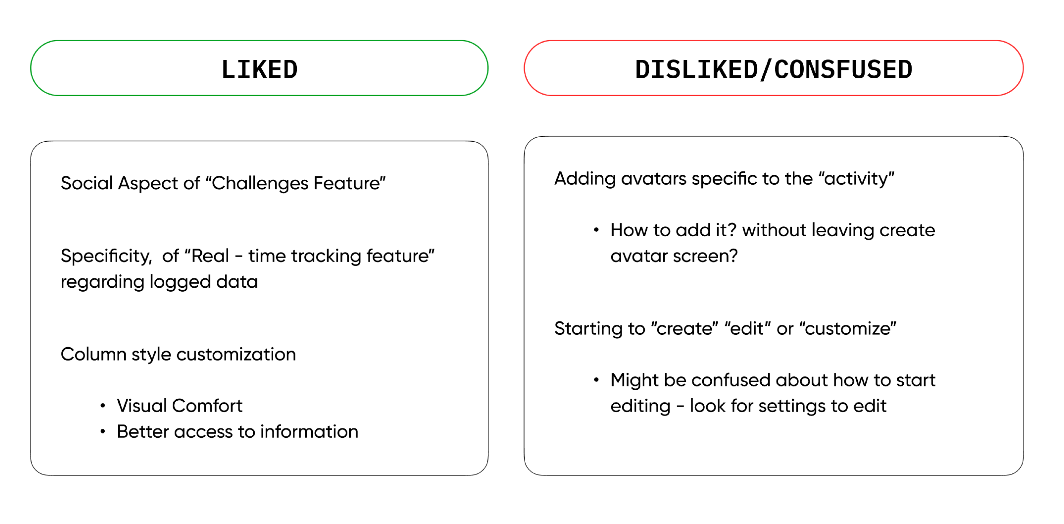
Overall, feedbacks were very positive regarding all 3 new feature ideas. Below is the gathered summary from participant quotes and my analysis:
Screenshots from test iteration process
Highlighted Quote
Focus On...
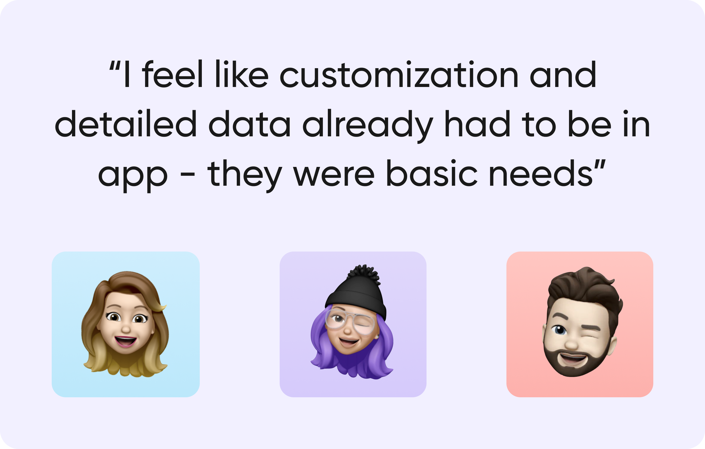
Users liked all features but felt like the “information accessibility” and “customization” already had to be on app, while the “challenges” feature adds additional motivational aspect. This means, customization/layout, better visualization and clarity is a necessity while ‘Challenges’ is a motivational addition to the app.
So, I will be focusing on fulfilling the necessities for users first:
- Customization & Personalization
- Integration of MEMOJIS
- Layout editing options
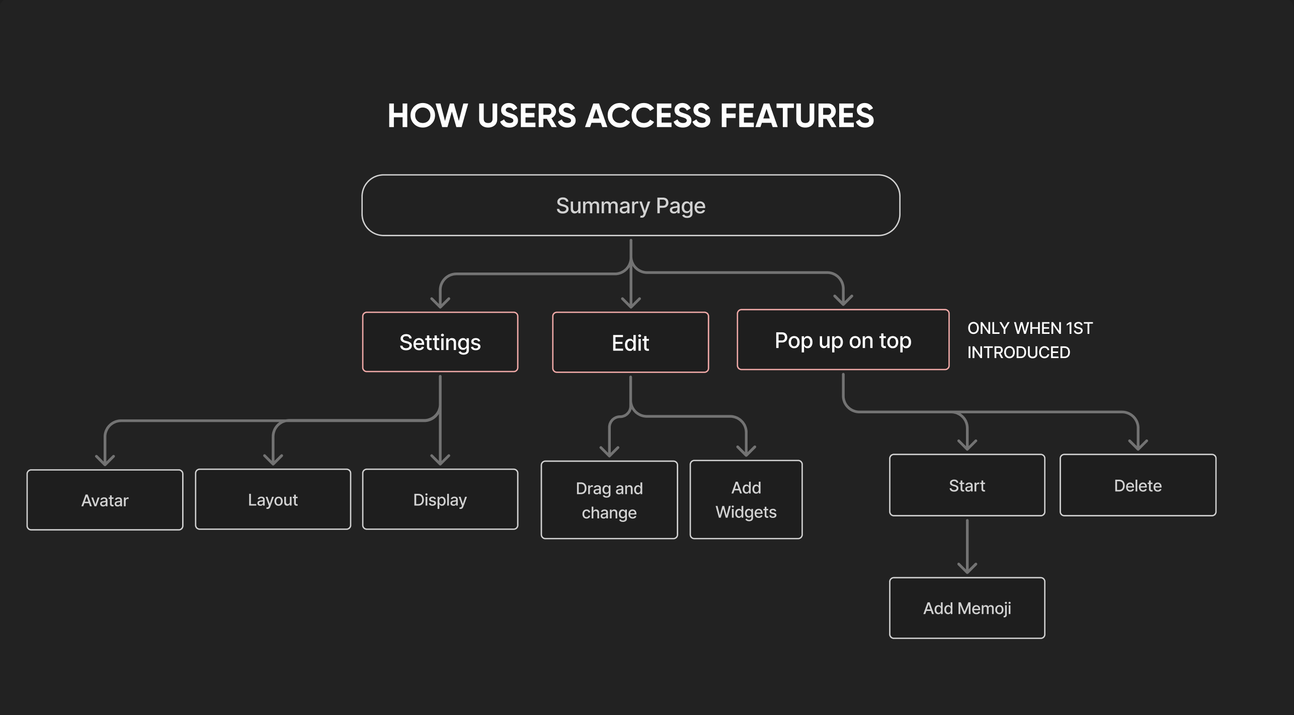
Creating site map, User flow
04. Final Features Design
Skip to next steps and PlansAdding and Customizing avatar
Less Confusion
Fun
Better recognition of the “widget”
Less Confusion
Increased Engagement
Clarity
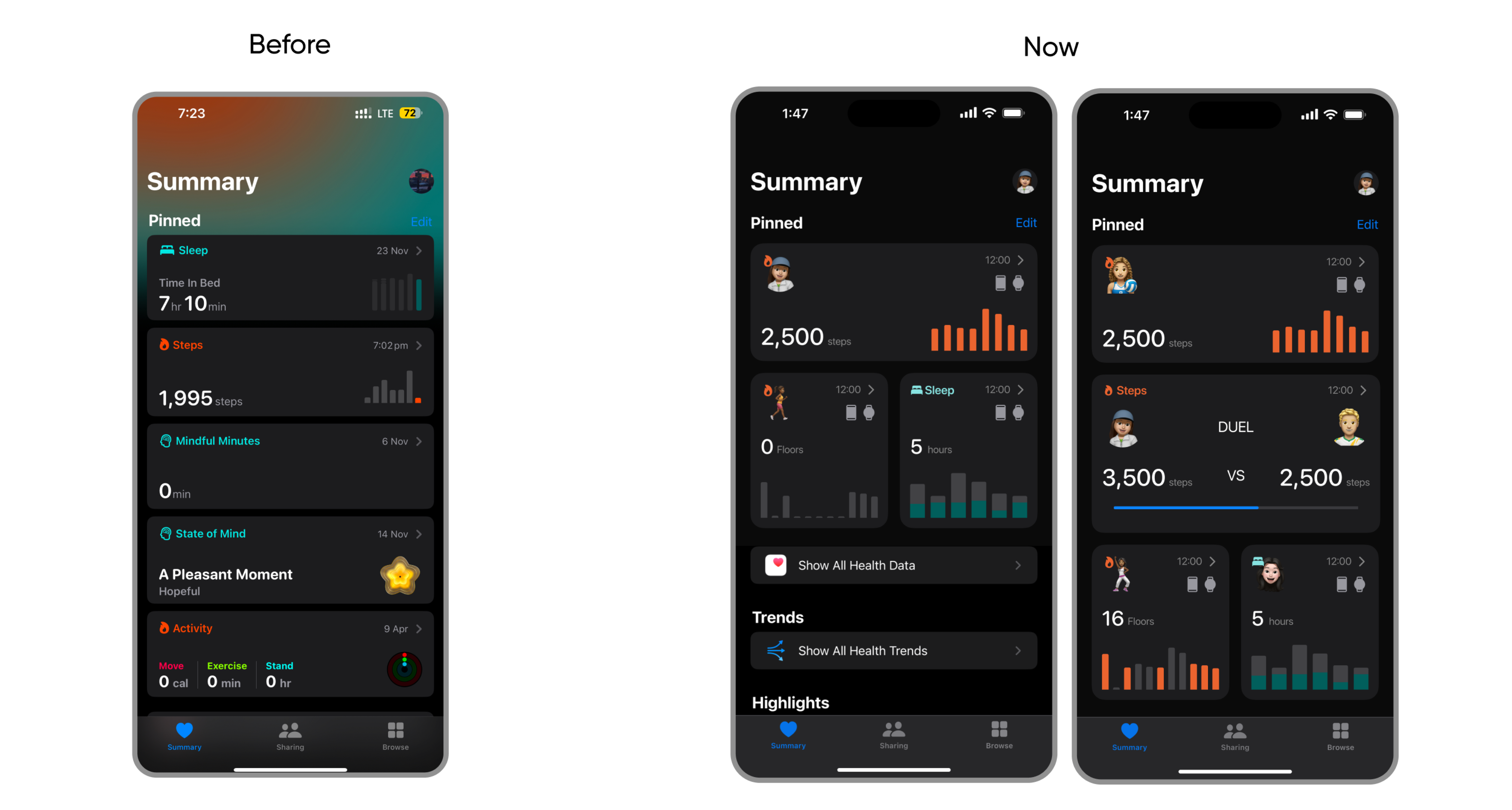
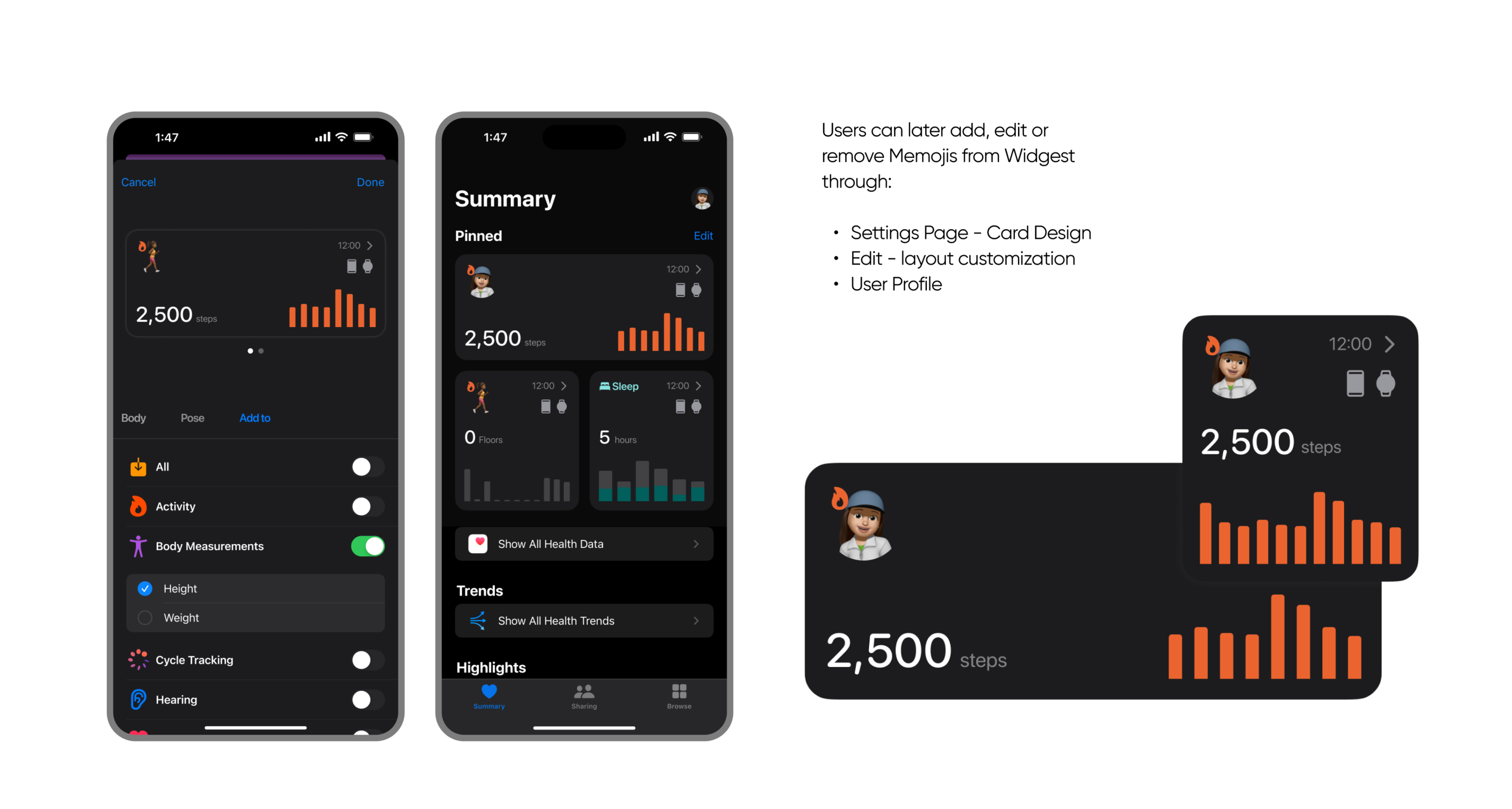
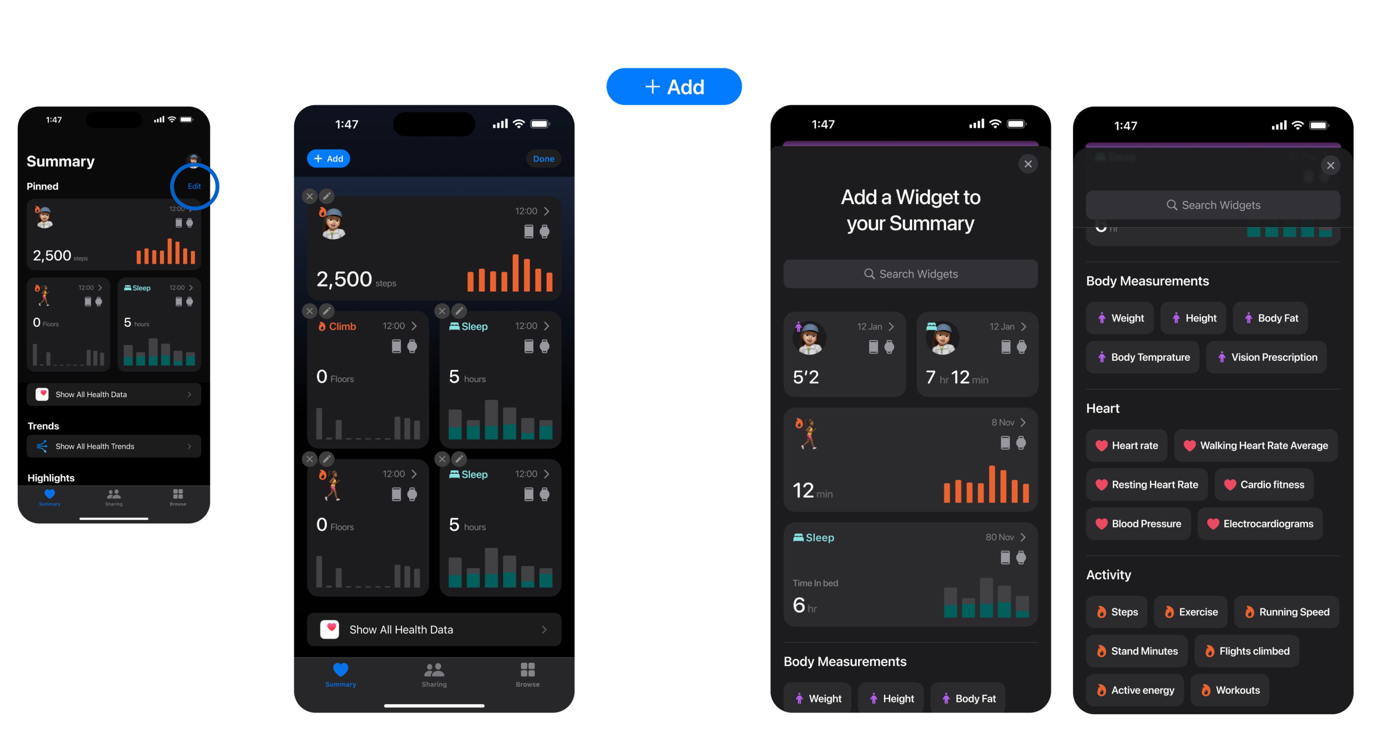
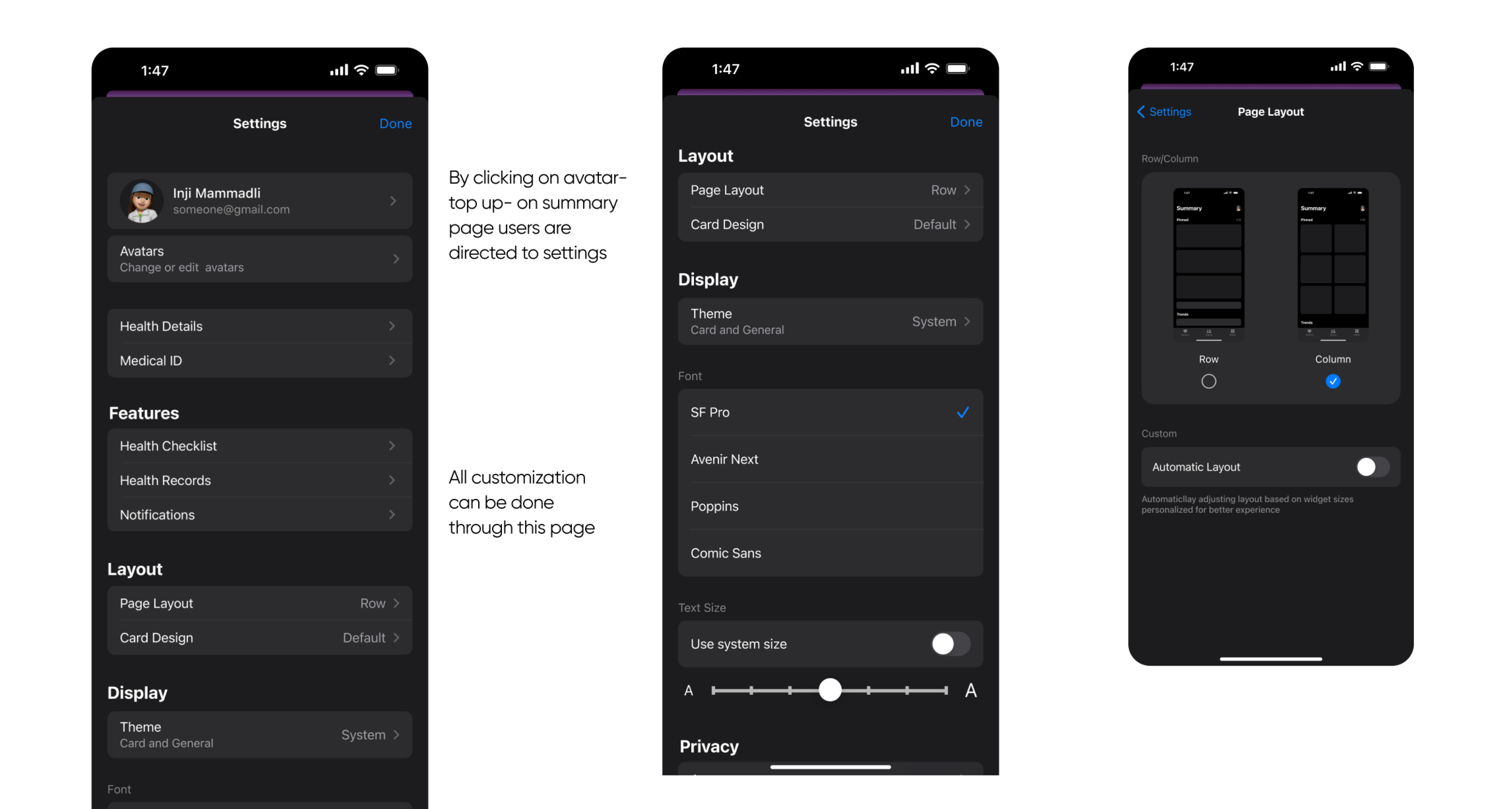
Adding or removing widgets, changing features, or repositioning existing widgets.
Visual comfort
Clarity
Less Confusion
Easy Navigation
1. EDITING LAYOUT WITH “EDIT BUTTON”
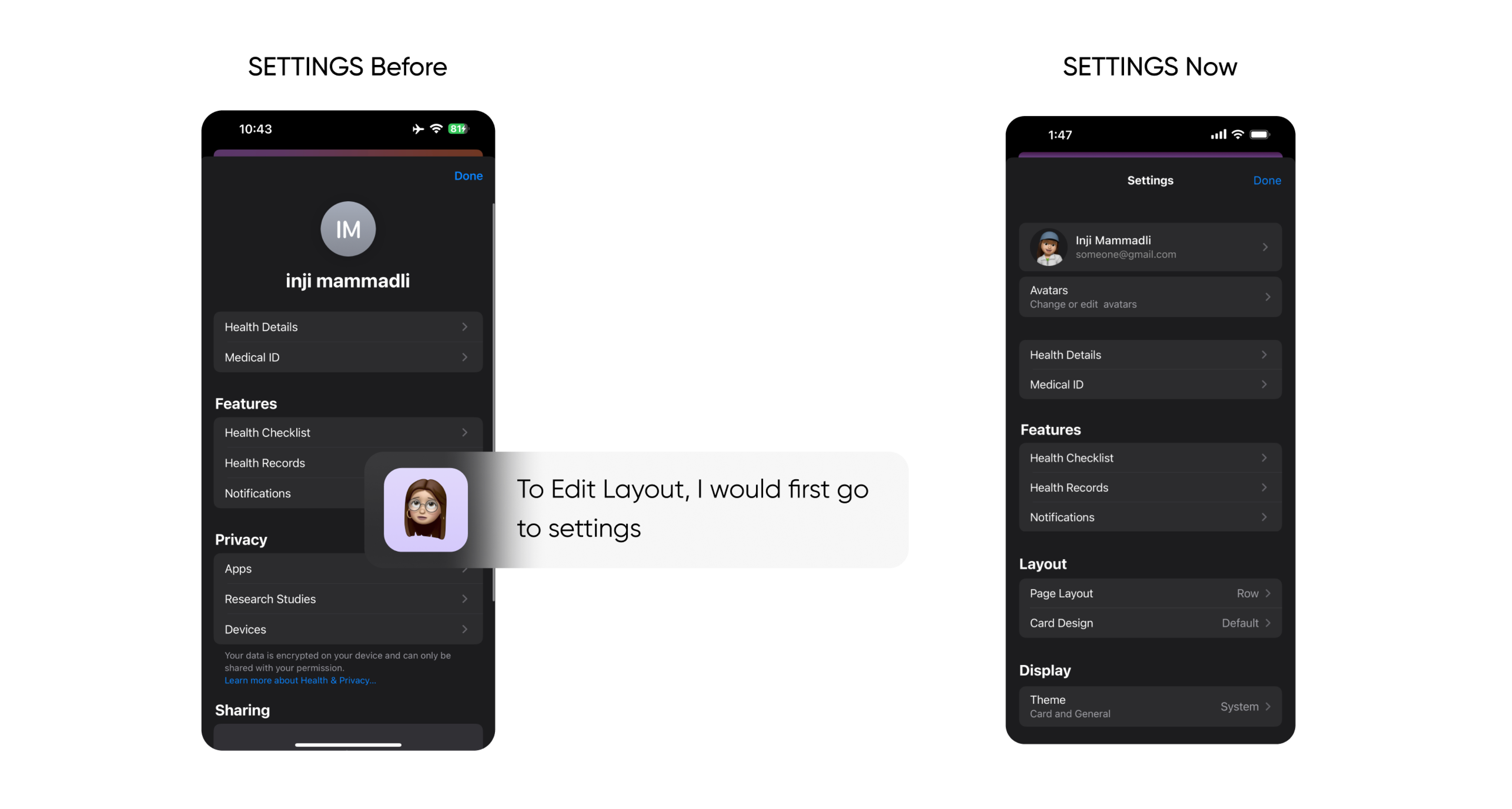
2. EDITING LAYOUT THROUGH SETTINGS
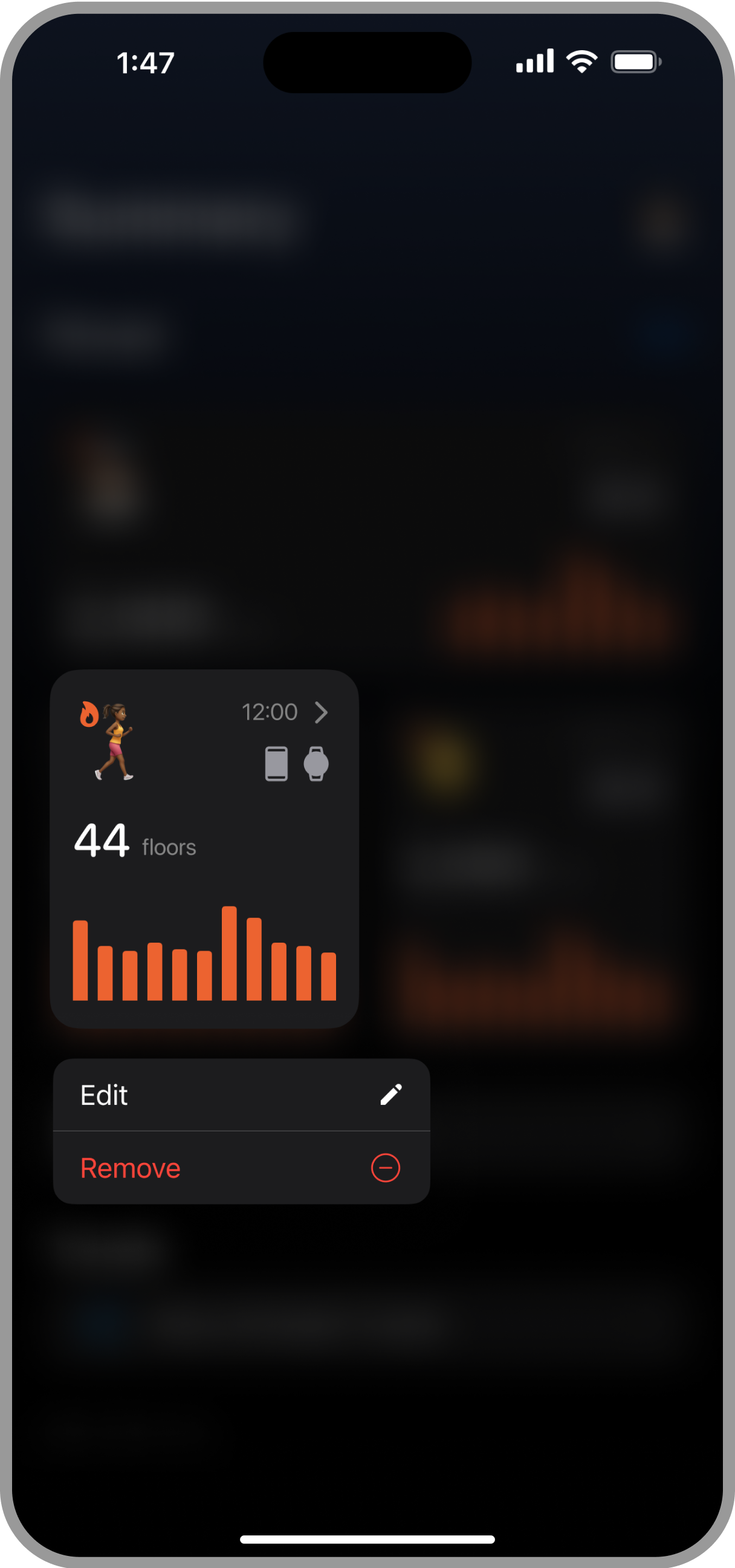
3. HOLD AND EDIT
By holding the widget user can edit or remove it too
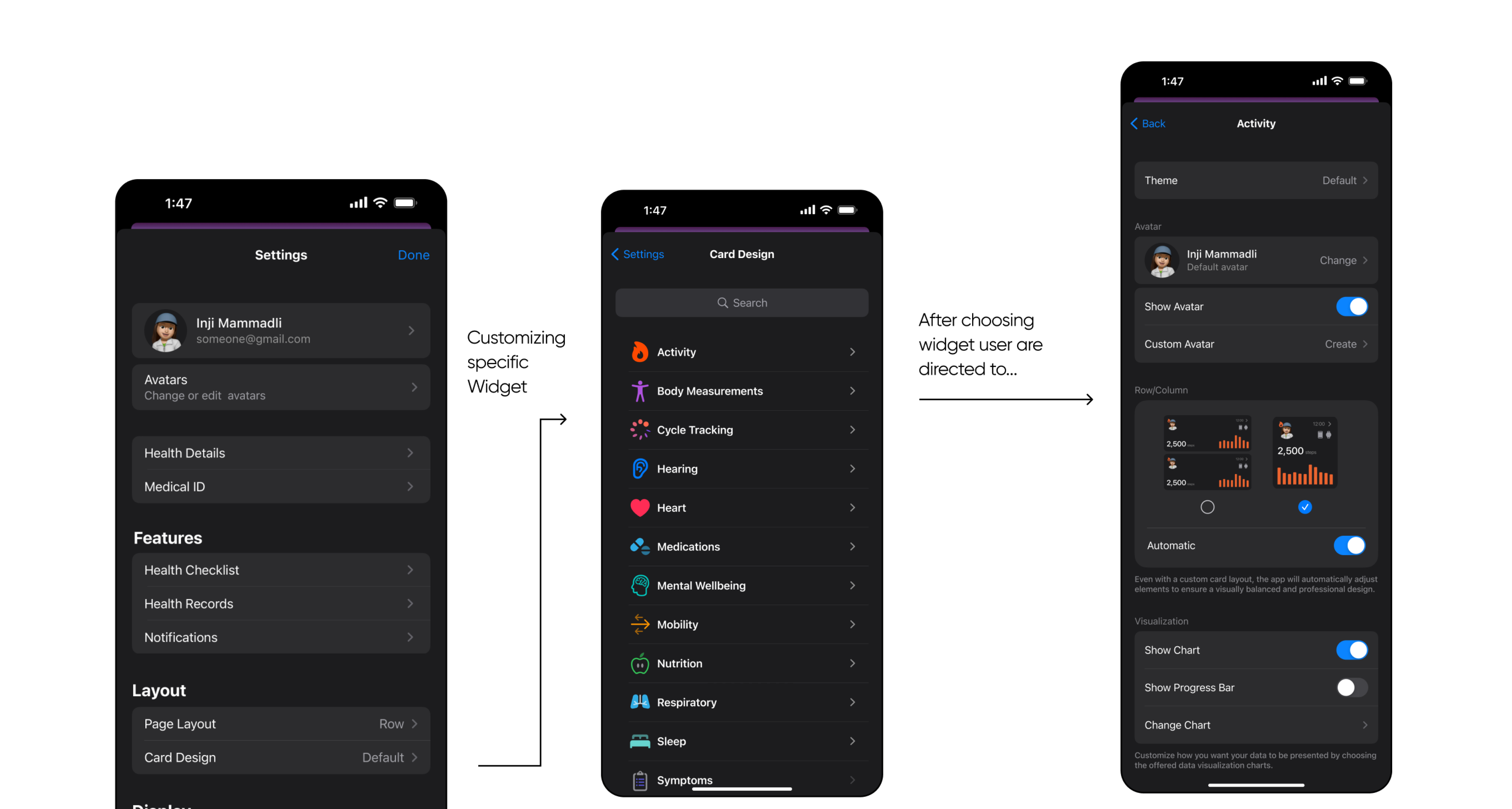
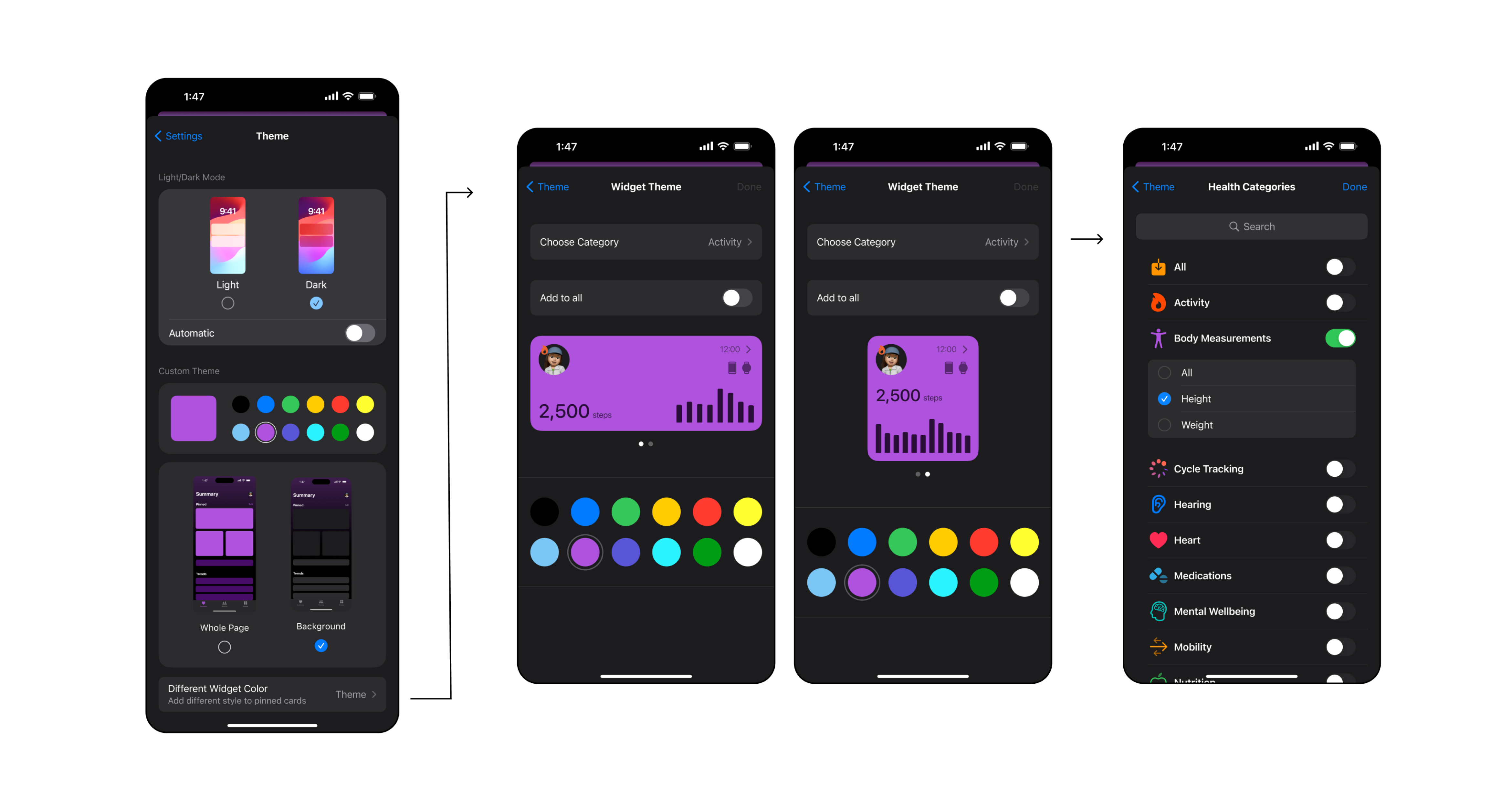
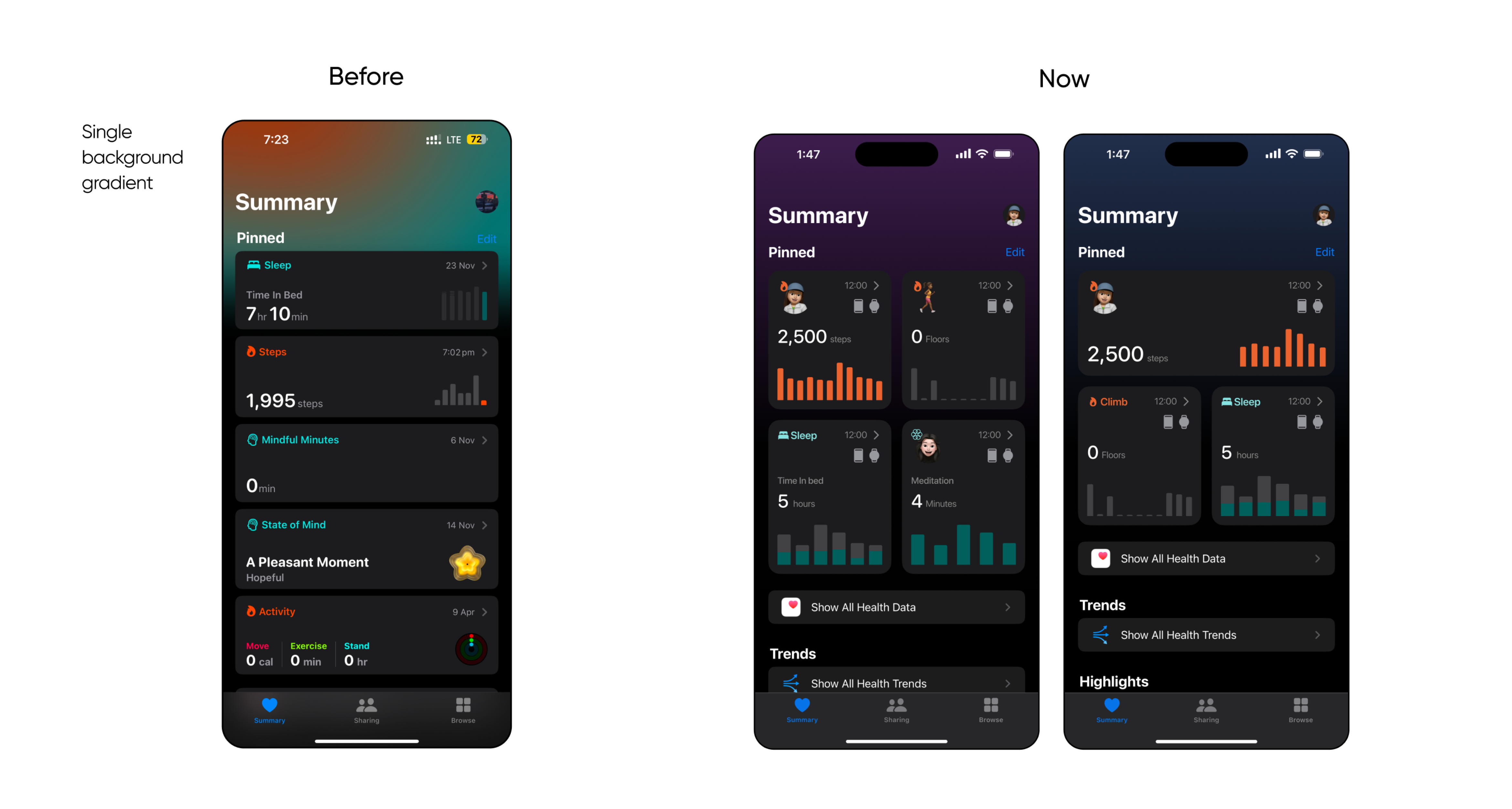
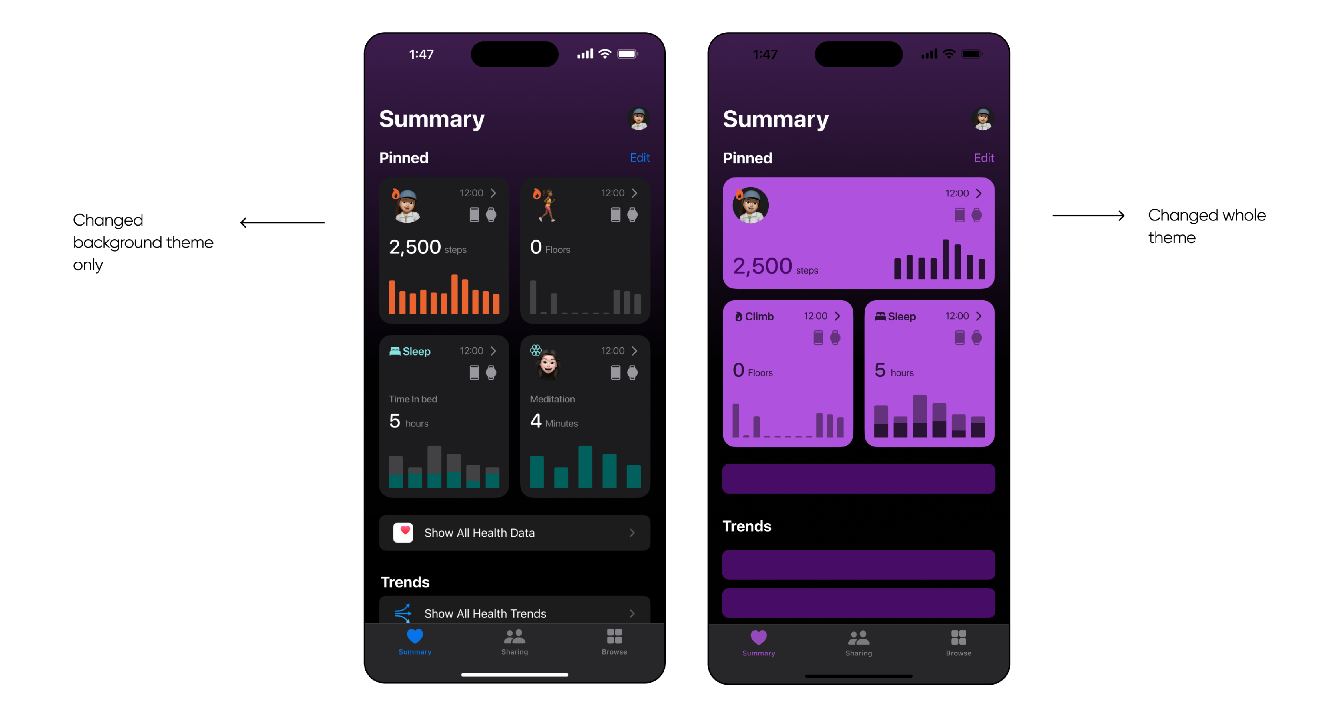
Theme, Color and other customizations
Visual comfort
Clarity
Less Confusion
Easy Navigation
“App is too boring - blunt and dark”
Enhancements to Implement
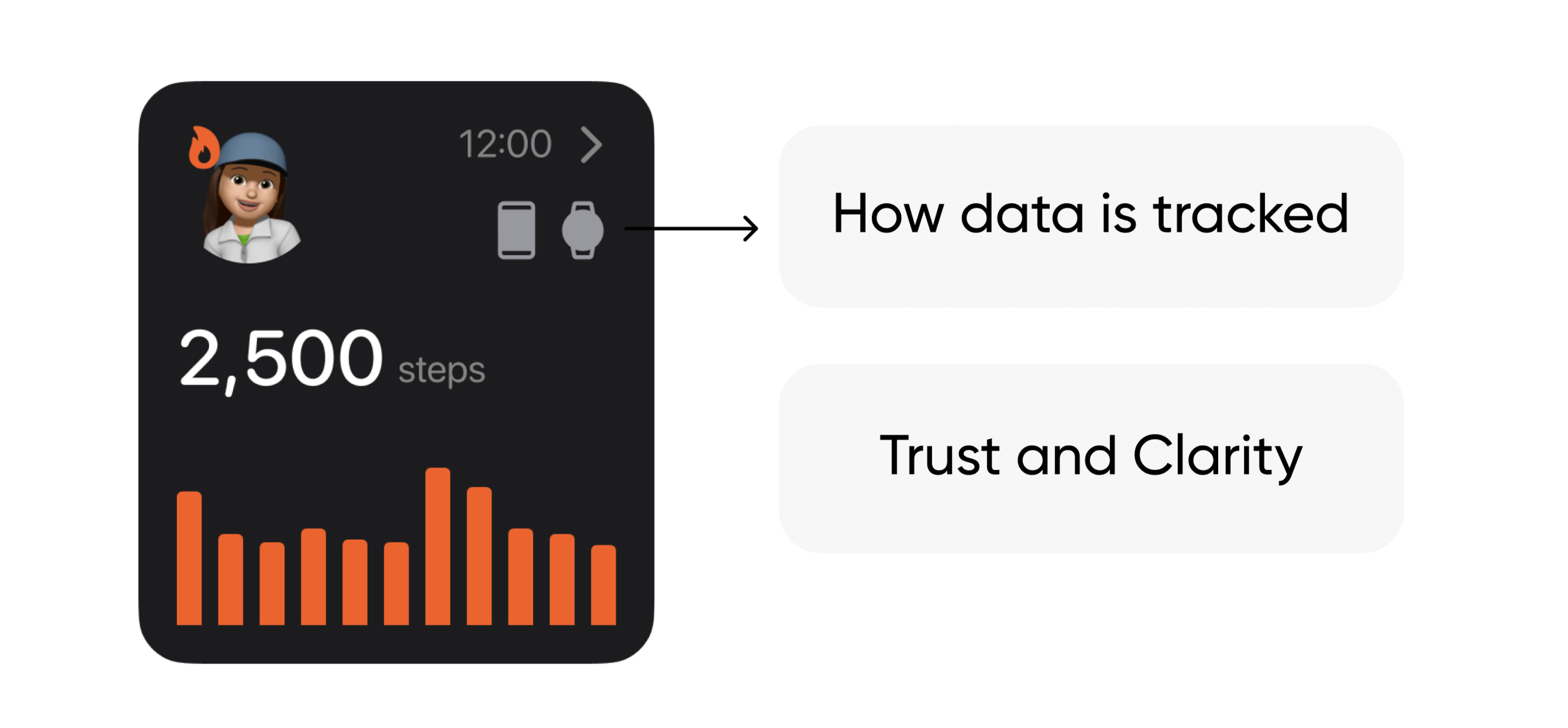
I think there is a need for better data tracking, trust, and clarity. To elevate the Apple Health app, I would want to implement custom data charts. These will enhance the visualization of health metrics, making the data more accessible and easier to understand for users.
I already added these two icons in my redesign of “widgets” to enhance the trust of users by giving them idea about how data has been tracked. So, mt next steo would be to iterate on . this and test it further to understand the extend of its effects and how else it can be improved.
Next time I would...
In future iterations, I aim to expand the user base by adapting the app to cater to different types of Apple Health users. I also plan to improve how data and customization features integrate with the Apple Watch, making the app more functional and user-friendly across Apple devices.
